SEARCH
Categories
Tags
Links
Archives
- September 2015
- July 2013
- May 2013
- September 2011
- January 2011
- December 2010
- November 2010
- September 2010
- August 2010
- July 2010
- May 2010
- April 2010
- March 2010
- December 2009
- November 2009
- October 2009
- September 2009
- August 2009
- June 2009
- May 2009
- April 2009
- March 2009
- February 2009
- January 2009
- December 2008
- November 2008
Visualizing Library Checkout Data
The first project for MAT259: Data Visualization involved exploring ways to display library checkout data in a 2D space. I chose to investigate how long each item was checked out and how it relates to item type, category or shelving section.
My goal was to be able to make qualitative judgements on how checkout duration trends vary over various item categorizations. For example, are Children’s items checked out longer than Young Adult items? Are Books checked out longer than DVDs?
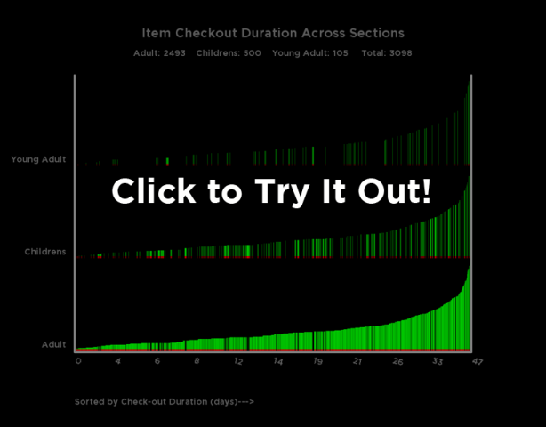
Click the image below to try the applet out and note the keyboard options described below the program.
The demonstration program incorporates only one hour of checkout data to reduce loading time.
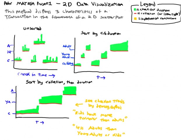
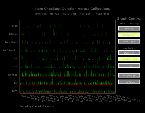
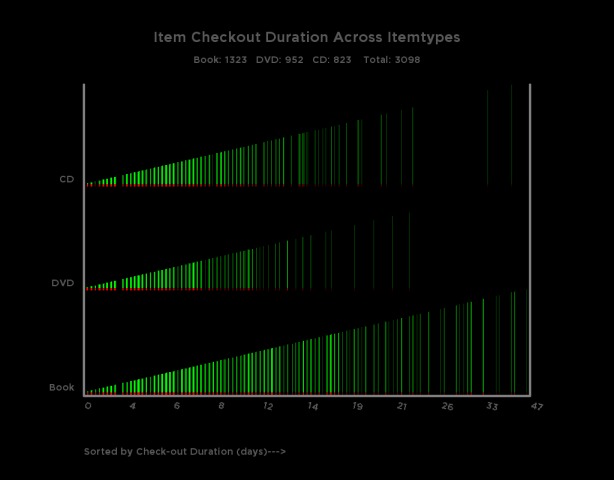
Below is my concept sketch and some screenshots from the program.
The image above uses a special method for assigning x-coordinates that is based soley on the how the checkout duration compares to the maximum duration in the dataset. Because it does not depend on the position of the transaction in the dataset it is unaffected by sorting parameters. This view is useful to quickly see where checkout durations congregate (brighter green areas) or where there are no transactions with durations in a certain range (gaps).
To keep the visualization from getting too cluttered, catagories representing less than 2% of the dataset have been ignored.


