SEARCH
Categories
Tags
Links
Archives
- September 2015
- July 2013
- May 2013
- September 2011
- January 2011
- December 2010
- November 2010
- September 2010
- August 2010
- July 2010
- May 2010
- April 2010
- March 2010
- December 2009
- November 2009
- October 2009
- September 2009
- August 2009
- June 2009
- May 2009
- April 2009
- March 2009
- February 2009
- January 2009
- December 2008
- November 2008
data visualization
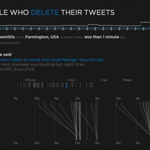
Aether: Exploring people who delete their tweets
Saturday, July 31st, 2010I presented my masters project on June 9th, 2010 to complete my degree of M.S. Multimedia Engineering in the Media Arts & Technology department at UCSB. I wanted to explore real-time data gathering and visualization and decided to use the Twitter API as the data source to see what I could do. My system consumes [...]
Keep Reading » Comments Off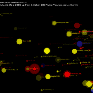
Concepts for visualizing deleted tweets
Wednesday, May 26th, 2010My deleted tweet visualizations have been through several concepts that were practice for the real thing. I experimented with Parts-of-speech tagging, Automatic text classification and other tools in an effort to dig deeper into the tweets that people take back. Below are some prototypes that inspired the final product. Text categorization and tweet lifetime (how [...]
Keep Reading » Comments Off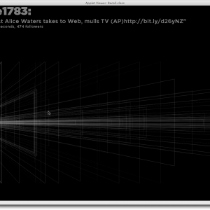
Deleted Tweets: taking back what was said
Thursday, April 22nd, 2010For my master’s project I am looking at deleted Tweets. More specifically, I am catching tweets that have been marked deleted by their sender and visualizing how they connect to the user themselves. To make this all possible I had to make some software that gathers and stores a high volume of tweet data for [...]
Keep Reading » Comments Off3D Data Visualization: Dewey Calendar
Friday, March 20th, 2009The final project for MAT259: Algorithmic Data Visualization involved visualizing data in 3D. Since we are using Library data I chose to investigate the Dewey Decimal category information. The Dewey Decimal system places every item in one of 10 broad categories that each have many subcategories. I wanted to investigate how the distribution of Dewey [...]
Keep Reading » Comments OffVisualizing Library Checkout Data in 2D Space
Monday, February 16th, 2009The second project for MAT259: Data Visualization involved exploring two dimensional space for visualizing data from the Seattle Public Library. I was interested in getting away from the traditional chart mentality and displaying data in a more unique way. I settled on comparing two numerical quantities using a seesaw or balance/scale metaphor. I chose to [...]
Keep Reading » Comments OffVisualizing Library Checkout Data
Saturday, January 24th, 2009The first project for MAT259: Data Visualization involved exploring ways to display library checkout data in a 2D space. I chose to investigate how long each item was checked out and how it relates to item type, category or shelving section. My goal was to be able to make qualitative judgements on how checkout duration [...]
Keep Reading » Comments Off