SEARCH
Categories
Tags
Links
Archives
- September 2015
- July 2013
- May 2013
- September 2011
- January 2011
- December 2010
- November 2010
- September 2010
- August 2010
- July 2010
- May 2010
- April 2010
- March 2010
- December 2009
- November 2009
- October 2009
- September 2009
- August 2009
- June 2009
- May 2009
- April 2009
- March 2009
- February 2009
- January 2009
- December 2008
- November 2008
Deleted Tweets: taking back what was said
For my master’s project I am looking at deleted Tweets. More specifically, I am catching tweets that have been marked deleted by their sender and visualizing how they connect to the user themselves.
To make this all possible I had to make some software that gathers and stores a high volume of tweet data for real-time processing and display. That part forms the technical side of my multimedia engineering degree but how I choose to present the data will be the more challenging conceptual portion of my project.
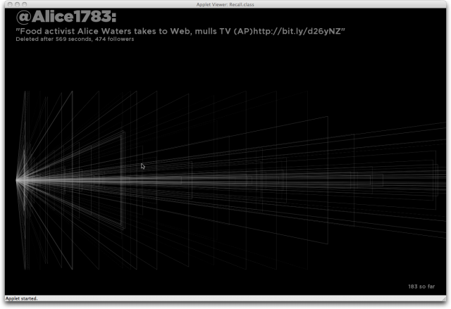
 Now that I have the data gathering happening I made a quick visualization prototype that shows how long each tweet was free in the wild before it was deleted (X-axis) and how many people likely could have seen the tweet (Y-axis), based on that user’s follower count. Thus the triangle acts as a sort of megaphone, showing how the tweet’s impact is amplified the longer it is published and the more people are registered as followers.
As the visualization runs, more tweets are added which helps see trends over time. This may not end up in the final project but it was interesting to see the deleted tweets stack up.