SEARCH
Categories
Tags
Links
Archives
- September 2015
- July 2013
- May 2013
- September 2011
- January 2011
- December 2010
- November 2010
- September 2010
- August 2010
- July 2010
- May 2010
- April 2010
- March 2010
- December 2009
- November 2009
- October 2009
- September 2009
- August 2009
- June 2009
- May 2009
- April 2009
- March 2009
- February 2009
- January 2009
- December 2008
- November 2008
3D Data Visualization: Dewey Calendar
The final project for MAT259: Algorithmic Data Visualization involved visualizing data in 3D.
Since we are using Library data I chose to investigate the Dewey Decimal category information. The Dewey Decimal system places every item in one of 10 broad categories that each have many subcategories.
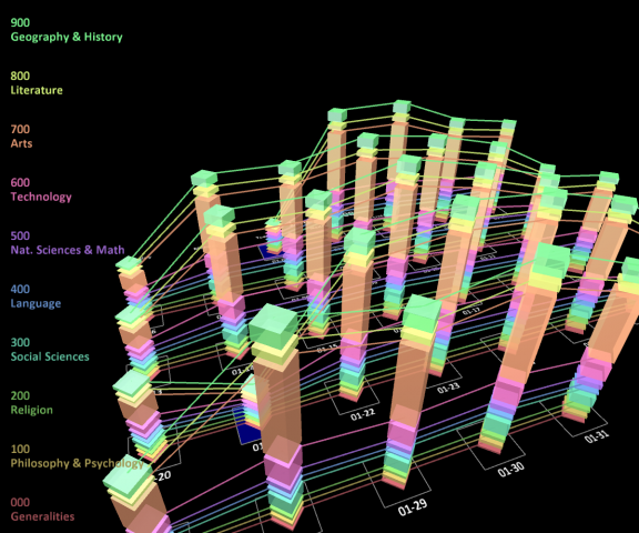
I wanted to investigate how the distribution of Dewey Categories varies over time so I plotted each day as a column with height proportional to the number of transactions. Each column is made of color-coded solids whose heights are determined by what percentage of daily transactions each category represents.
Each category is connected with a line to emphasize how the trend varies over time. The solids and lines can be independently toggled to vary the displayed information.
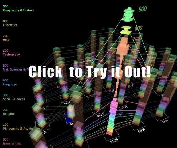
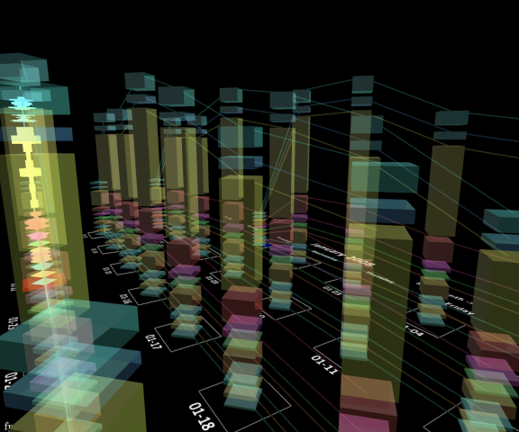
Clicking a column will display similar distribution data for the 10 subcategories within each main category — 100, 110, 120, etc. Here the width of the solid is proportional to its relative percentage within its category.
The applet displays data for the entire year of 2008. The month can be changed using the ‘[' and ']‘ keys or by clicking “Next Month” or “Previous Month” on the calendar near the month name.
The visualization can be rotated by clicking and dragging the mouse. Additional camera controls are explained on the applet page.


